How I became a pro at Enscape.


I've been using Enscape since version 1.9, almost about…seven years ago, and here are some videos and images I was making back then.
What I was making a few years ago with Enscape
Now…It might be hard to believe for the newer generations, but back then, this was really top-notch stuff... I swear!


Since that release, I've used Enscape for many of my projects and significantly improved my rendering skills! Today, I want to share some tips and tricks that helped elevate my renders from just okay to pretty awesome realistic renders.

Now, I don’t consider myself the best Enscape user out there. In fact, if you check out the Enscape forum, you'll be amazed and shocked by the high quality of work some users produce. From interior to exterior renders, the possibilities with Enscape are endless!
Today, I’ll break down how I created a series of images with Enscape, starting with a crucial but often overlooked step that applies not only to Enscape but to other software as well.
References
When creating an image, it's a common mistake to think everything needs to be built from scratch: new perspectives, magical lighting, figuring out colors, textures—the works! But that's far from necessary.
One key to success is starting with one or two reference images. These can set the direction for your render. In my case, I used an image from the 'Never Too Small' book, featuring 'The Warren'—a compact apartment in Australia with some really cool lighting, furniture, and overall composition that I loved.

Composition
I began by quickly drafting the space in SketchUp, modeling walls, floors, windows, etc. From my reference, I knew I wanted a portrait-oriented image of a living room with a yellow curtain in the foreground, vibrant large plants, a warm peach-toned sofa by a window that let in natural light, and a back wall with a wooden door, art frames, and other details, all over a tiled floor that caught soft shadows and a gold-covered closet to the right.

With this reference, I broke down my approach into four parts:
- Create a detailed base 3D model.
- Find quality 3D models similar to those in the reference image.
- Texture the scene to match the picture.
- Adjust the lighting and settings to mimic the original lighting setup.
Thanks to my reference, I quickly identified the elements I needed to start my image. And remember, don’t limit your references to just architectural renderings. Photography books, movies, and interior design websites are great for finding inspiration.

Knowing our main composition, we need to optimize our 3D model accordingly. It’s practical to avoid over-modeling and creating an excessively detailed model if we won’t use all of it. This just wastes resources and time.
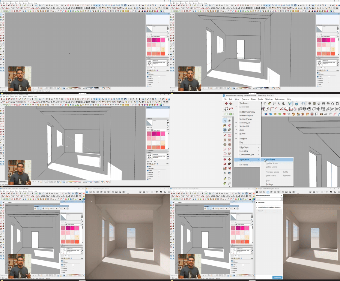
From the start, I save a scene with roughly the point of view and composition I want, so I can always refer back to it and track my progress.
I also set this up in Enscape, exporting renders from each stage. I just open my Enscape window, go to scene management, and adjust my scene, saving it also in my SketchUp scenes.
Understanding the main objects and their relationships is crucial. I like to sketch this out quickly on paper. This helps me grasp that the photo can be understood in three main planes, with a primary light source from the window and a focal point and balance at the door in the back.
Modeling
Although Enscape doesn’t currently offer a feature to round corners in the render engine, you can use plugins like RoundCorner by Fredo to soften visible angles in your models.
It’s very easy: just select your edges, open the plugin, click on RoundCorner, adjust the settings, and voilà! My window transitions from looking like this to this. Rounding the edges of this beam also enhances its appearance significantly.


Materials
For this image, several important materials were needed. First, the floor. I downloaded a floor texture from Quixel. This was free and very high-quality.
To apply this material, I create a new material, then import the albedo map into the albedo texture, add a displacement texture, and then the roughness texture. Here, you don't want to overdo it. Just enough to give the floor this specific texture. These are the settings I used, and I really liked the result.
Next, we apply the wall material. Although we can't see much of the wall's texture in our reference photo due to overexposure, I want there to be a grainy, rough texture on the walls in my close-up renders.
I also downloaded a wall material from Quixel and imported the normal and roughness maps. Here are the final settings I used, along with some renders showing a close-up of the walls. Here are some other wall material options directly from the Enscape material library, which, as you can see, work pretty well too!


Final Images
These are some of the images I created using all these tips, and overall, I think these tips are useful if you're just starting out in Enscape and want to get a head start and improve your rendering skills.
Check out the complete video here.


